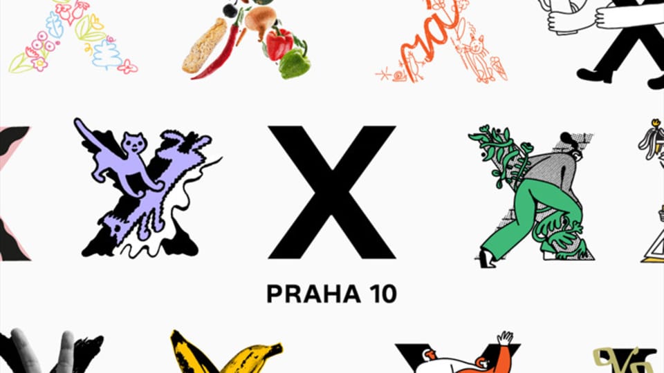
Photo: MČ Praha 10
The Prague 10 district has just unveiled a new visual identity that works with various takes on the logo X, the Roman numeral for 10. This follows a similar move by Prague 3 some years ago, when it even started selling merchandise with a logo comprising three lines. But what is the value of this kind of branding? I put that question to top Czech graphic designer Pavel Fuksa.
“For me the branding of Prague districts is somehow a positive and natural evolution of the city’s identity.
“We’re all familiar with the overall sort of umbrella branding for Prague, that well-known red square with four lines of Prague being written in different languages.
“But that serves as a sort of overwhelming, generic Prague branding.
“For me, Prague with its rich history has always been a mosaic of distinct districts and quarters, each with its own unique character and spirit.
See the rest here.
Author: Ian Willoughby

